
If you’ve shopped online, you are all too familiar with the standard ecommerce pop-up. Nine times out of ten, you’re probably seeing the same ecommerce pop-up offer: “10% off your first order!” You might even be offer-blind at this point, because you are so used to seeing the same thing on every website.
Here’s the thing - there’s nothing inherently wrong with that offer. New customers love an incentive to make a purchase decision, and offering a discount is great to get someone to try your product. The problem is that consumers have seen it thousands of times. At this point, most shoppers can identify a generic pop-up before they even finish reading the headline.
The brands seeing the best conversion rates today aren’t necessarily offering bigger discounts. For most ecommerce brands, email signup pop-ups and SMS pop-ups are still some of the most effective tools for email list growth and customer acquisition. The most effective brands are creating lead gen experiences that feel more engaging, interactive, personalized, or aligned with their brand. They also make the experience feel less intrusive.
With that in mind, we’ve put together a collection of different spins on the classic lead generation pop-up that you can try on your website. Here are some of our favorite lead gen pop-up concepts ecommerce brands should test if they want to stand out from the standard template.
1. The Standard Discount Pop-Up (Done Well)
Let’s start with the obvious one.
A percentage-off pop-up can absolutely still perform well — especially for first-time visitors. But there’s a big difference between a polished, branded experience and a generic Shopify pop-up template that looks identical to every other ecommerce store.
The best versions typically:
Use stronger headline copy
Give shoppers a compelling reason to subscribe beyond the discount (the exchange should be equitable)
Feel aligned with the brand (in both imagery and copy)
Keep the messaging simple
Create a little urgency or exclusivity
Avoid cluttered designs
Instead of:
“Sign up for 10% off”
Try:
“Join for early access, new drops, and 10% off your first order.”
Or:
“Become a VIP member and unlock your welcome offer.”
The offer itself hasn’t changed much — but the framing feels more intentional.
First Order Offer Pop-Up Example

LATHER
2. Spin-to-Win Pop-Ups
Spin-to-win pop-ups have been around for years, but they still work because they add interactivity to a familiar offer.
Even if most users understand they’re going to land on a common discount tier, the experience feels more engaging than a static email form. For many ecommerce brands, spin-to-win pop-ups continue to drive strong pop-up conversion rates because they encourage interaction before asking for an email capture.
These tend to work especially well for:
High-traffic ecommerce stores
Beauty & Fashion brands
Lower AOV products
Mobile-heavy traffic
That said, they aren’t the right fit for every brand. Luxury or premium-positioned companies may find them too gimmicky.
The key is matching the experience to the brand identity.
Spin To Win Pop-Up Example

Bloom
3. Quiz & Personalized Pop-Ups
Quiz pop-ups work because they create engagement before asking for the email address.
Instead of immediately presenting a discount, the brand invites the visitor into a personalized experience:
“Find Your Routine”
“Take the Quiz”
“Get Personalized Recommendations”
This format is especially effective for brands where product discovery matters:
Beauty & Wellness
Supplements
Apparel
Haircare
Quiz pop-ups help collect valuable zero-party data that can later improve email and SMS personalization. A quiz pop-up can also vary in the level of detail being collected before an email is submitted. Even asking one simple question before asking for someone’s email can increase conversion as well as populate extra data in your customer database. More importantly, quiz pop-ups simply feel less transactional. They also work well as ecommerce lead generation tools because visitors engage with the experience before reaching the email signup form.
A visitor who answers questions about skin type, fitness goals, or style preferences is far more valuable than a generic subscriber who only entered their email for a discount.
Quiz Pop-Up Example
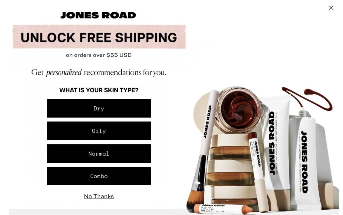
JONES ROAD
4. Micro-Commitment Pop-Ups
One of the biggest trends in ecommerce lead generation right now is the rise of micro-commitment pop-ups.
Instead of immediately asking visitors to enter their email address, these pop-ups first ask a simple low-friction question:
“Would you like 15% off?”
“Want early access?”
“Ready to unlock your offer?”
Once the visitor clicks “Yes,” the actual signup form appears.
It’s a small UX shift, but psychologically it changes the interaction completely. Rather than immediately confronting visitors with a form, brands first encourage a tiny engagement action.
This format has become especially common among beauty, fashion, and wellness brands because it feels more interactive while still keeping the overall offer straightforward.
It’s also a good reminder that improving pop-up performance doesn’t always require a brand-new offer. Sometimes the biggest lift comes from small experience changes.
Microcommitment Pop-Up Example:
iT COSMETICS
5. VIP or Early Access Pop-Ups
One of the easiest ways to make a pop-up feel less generic is to position it around exclusivity instead of discounts.
Rather than asking users to “sign up for emails,” brands can frame the offer as access:
Early access to launches
VIP-only promotions
Limited drops
Insider updates
Members-only releases
This approach tends to work especially well for:
Fashion & Lifestyle brands
Limited-release products
Creator-led brands
The psychology is simple: people want to feel like they’re joining something, not subscribing to marketing.
VIP and Early Access Pop-Up Example
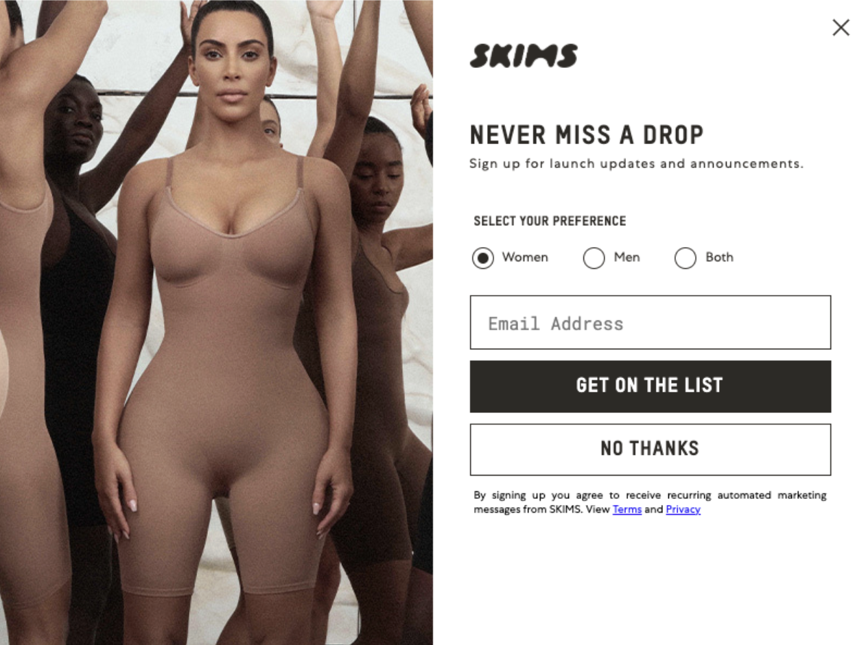
SKIMS
6. Free Gift Offers
Sometimes perceived value converts better than a percentage discount.
That’s why many brands are shifting toward:
Free gifts
Free samples
Trial-size products
Gift-with-purchase offers
Instead of just offering a discount, the ecommerce pop-up frames the incentive around receiving something extra with the first order. This strategy works especially well for beauty & wellness brands.
A free gift often feels more tangible and exciting than a relatively small discount — especially when the featured product is visually appealing.
It also gives brands an opportunity to introduce customers to additional products that may drive repeat purchases later.
Free Gift Offer Pop-Up Example:

Prose
7. Pop-Ups That Align With Current Campaigns
One of the easiest ways to make an ecommerce pop-up feel more intentional is to align it with whatever campaign the brand is already running on-site.
Too many brands keep the same evergreen pop-up live year-round, even while homepage banners, email campaigns, and paid ads are promoting something completely different.
The strongest pop-up experiences usually feel connected to the current marketing moment:
Seasonal sales
Product launches
Holiday campaigns
Limited-time collections
Sitewide promotions
For example, if a brand is running a summer sale, the pop-up might promote:
Early access to the sale
Additional perks for subscribers
SMS access to limited inventory
A gift tied to the campaign
This creates a more cohesive customer experience and makes the pop-up feel less like a generic interruption layered on top of the site.
It also naturally increases urgency because the offer feels timely instead of permanent.
Promotion Pop-Up Example:
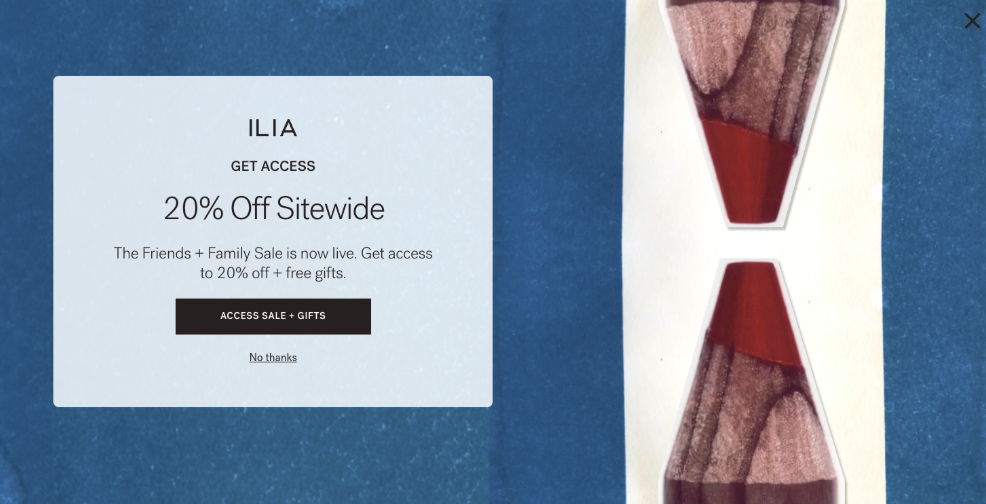
ILIA
8. Behavior-Based Pop-Ups
It’s no surprise that some of the highest converting ecommerce pop-ups are customized to the user and what they are viewing on your site. Instead of showing every visitor the exact same message, brands can trigger different lead capture offers based on behavior:
Product specific call outs based on what a user is viewing
Back-in-stock notifications
Product education on PDPs
Category-specific offers
Exit-intent messaging
Returning visitor offers
For example:
A visitor browsing skincare products might see a quiz offer
A shopper viewing sold-out inventory might see a restock signup
A returning visitor might receive a stronger incentive than a first-time user
Relevance almost always converts better than generic messaging.
Behavior-Based Pop-Up Example:
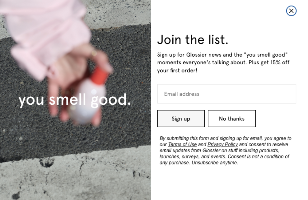
Glossier
Best Practices for Higher-Converting Pop-Ups
Even the best offer can underperform if the experience itself feels overwhelming.
Here are a few principles the highest-converting brands consistently follow.
Keep the Experience Simple
Most pop-ups fail because they try to do too much.
Focus on:
One message
One CTA
Minimal form fields
Clear visual hierarchy
The easier the experience feels, the better it usually performs. Small UX improvements can have a major impact on ecommerce pop-up conversion rates over time.
Match the Pop-Up to the Brand
A luxury skincare brand should not use the exact same pop-up style as a fast-fashion retailer.
The design, copy, animation style, and overall tone should feel aligned with the rest of the website experience.
When pop-ups feel disconnected from the brand, they immediately come across as intrusive.
Use Smarter Triggers
Timing matters just as much as the offer itself.
Some of the most effective trigger strategies include:
Exit intent pop-ups
Scroll depth
Product-page targeting
Returning visitor logic
Time-on-site delays
Showing a pop-up immediately after page load is one of the fastest ways to create a bad user experience.
Don’t Overwhelm Visitors
Too many ecommerce sites stack:
Email pop-ups
SMS pop-ups
Chat widgets
Announcement bars
Spin wheels
…all at the same time.
The result is usually lower engagement, not more.
A good pop-up strategy should improve the customer experience, not interrupt it.
Test More Than Just the Offer
Most brands only test the incentives themselves.
But some of the biggest conversion improvements often come from:
Headlines
CTA copy
Layout
Timing
Mobile optimization
Imagery
Trigger behavior
Small UX improvements compound quickly over time.
The Best Pop-Ups Don’t Feel Like Pop-Up
At the end of the day, most ecommerce brands are not struggling because pop-ups stopped working. They are struggling because customers have learned to ignore generic experiences.
The brands getting the best results right now are not necessarily offering bigger discounts or more aggressive incentives. In most cases, they are simply creating lead capture experiences that feel more relevant, more interactive, or more aligned with the rest of the brand.
Sometimes that means using quizzes or micro-commitments. Sometimes it means tying the pop-up into a larger campaign already happening on-site. And sometimes it just means making a standard first-order offer feel more intentional.
Because the difference between a pop-up that gets instantly closed and one that actually converts usually comes down to one thing:
Does it feel like part of the customer experience, or just another interruption?
Sources
LATHER – 10% off email sign-up pop-up screenshot, captured from brand website
Bloom Nutrition – Spin-to-win first-order offer pop-up screenshot, captured from brand website
Jones Road Beauty – Free shipping skin type quiz pop-up screenshot, captured from brand website
IT Cosmetics – 15% off offer pop-up screenshot, captured from brand website
SKIMS – Launch updates sign-up pop-up screenshot, captured from brand website
Prose – First-order exclusive offer pop-up screenshot, captured from brand website
ILIA – Friends + Family sale access pop-up screenshot, captured from brand website
Glossier – Email sign-up offer pop-up screenshot, captured from brand website